THE ART PEACE
The Art Peace was inspired by a recent shift in political and cultural norms that underscore the urgent need for global unity and peace in a time of heightened global tensions. Art is the universal language of humans and a powerful tool for inter-cultural communication, capable of unifying people for a common good.
The launch of The Art Peace was timed to coincide with the more than 14 prominent art fairs occurring during the first week of December in Miami and Miami Beach. The fairs are expected to draw over 100,000 international visitors, thousands of artists and hundreds of gallerists generating a multi-billion dollar economic impact for the Miami/Miami Beach area.
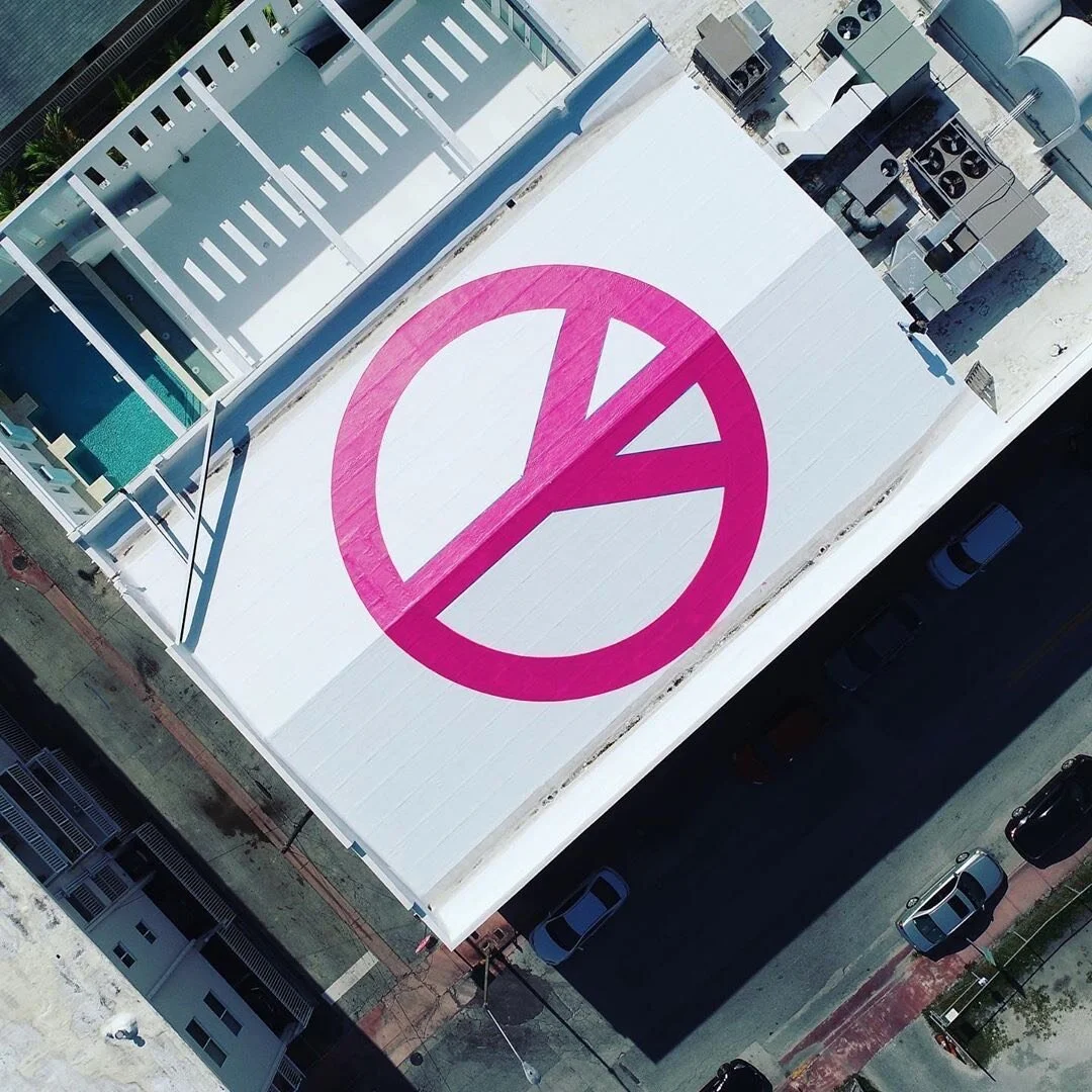
The color pink was chosen by the artists as the main color for The Art Peace. Pink is the color most often associated with charm, politeness, sensitivity, tenderness, sweetness, childhood, femininity and the romantic (Wikipedia) and is used frequently to adorn the many Art Deco buildings that have helped make Miami Beach one of the most visited cities in the world.
Visible from space, planes and drones, The Art Peace reflects light with an approximate wavelength of 501.66 nanometers. The unique pink color has a hexadecimal color code #b54d7f and in the RGB color model, #b54d7f is comprised of 70.98 percent red, 30.2 percent green and 49.8 percent blue. In the HSL color space, The Art Peace pink has a hue of 331 (degrees), 41 percent saturation and 51 percent lightness.
The peace sign was originally designed by British artist Gerald Holtom in 1958 as the logo for the Campaign for Nuclear Disarmament.